Responsive Website Design
Redesign of Medical Supplies Website: improving user experience and increasing sales conversion.

Redesign an eCommerce website for medical supplies to improve the user experience and increase sales conversion while ensuring compliance with modern accessibility standards.
To improve the user experience to make purchasing medical supplies simple and stress-free, while also increasing sales conversions by creating a more engaging and accessible interface.
Problem:
The existing website for medical supplies had several key issues:
> Users found the site difficult to navigate, leading to high bounce rates.
> The checkout process was long and confusing, resulting in cart abandonment.
> The site lacked proper accessibility features, alienating a portion of users with disabilities.
> The design looked outdated, and the lack of modern UI practices made it difficult to trust the website.
> Despite a significant number of visitors, sales conversions were low.
Hypothesis:
By streamlining the user journey, improving navigation, enhancing accessibility, and implementing a modern UI, we could improve the overall shopping experience, increase sales conversion, and reach a broader audience.
My Role: UX/UI designer
Responsibilities:
> Conducted user research and usability testing.
> Led design ideation and create wireframes, prototypes, and high-fidelity mockups.
> Worked closely with developers to ensure the design was implemented as intended.
> Test and iterate based on feedback to refine the final product.
> Collaborated with Medical Supplies management teams and customer support teams
It all started when I was consulting for an e-commerce medical supplies store in Saudi Arabia regarding issues with their WordPress website plugins. The stakeholders reported a decline in conversion rates and an increase in customer complaints. Many users found the website difficult to navigate, particularly when searching for specific products, which led to high cart abandonment rates. The stakeholders voiced concerns about the overall user experience. Based on these challenges, I proposed a website redesign that would address both customer expectations and business goals, ensuring the new design would meet user needs and improve the site's functionality.
Stakeholders were identified through a comprehensive mapping process:
Online Shoppers (end user)
Medical Supplies management, sales teams, and customer support
In discussions with these stakeholders, several pain points emerged:
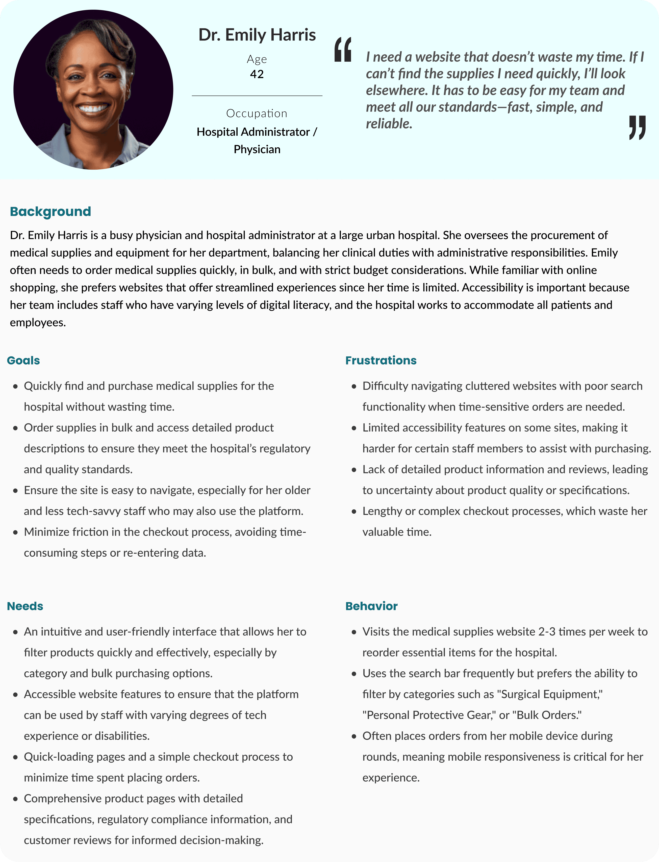
> Healthcare professionals and elderly users found the site overwhelming, especially in urgent situations.
> Accessibility issues were prominent, with feedback showing that users with disabilities struggled to interact with the site.
> Product pages lacked sufficient information, leading to frustration.
Gathering Information
To understand the root causes of the website's performance issues, I initiated a comprehensive research phase. This involved:
>Reaching out to existing customers, especially healthcare professionals and elderly users, to understand their challenges and needs. Many reported frustration with the search functionality, lack of filter options, and long loading times on product pages. I also interviewed customer support staff to gather insights on common user complaints.
> I analyzed the website’s metrics using tools like Google Analytics and Hotjar, identifying high bounce rates, abandoned carts, and specific pain points such as long load times on checkout pages.
> To benchmark, I conducted an analysis of competitor sites. I explored how other medical supplies stores organized their catalogs, optimized their product pages, and handled accessibility, which gave me a clearer picture of industry standards.
> Since many of medical supplies store users were elderly or had disabilities, we reviewed the latest accessibility guidelines (WCAG 2.1) to ensure that the redesign would cater to all users effectively.
Identified User Needs
> Users need a clear, intuitive way to find medical supplies quickly without excessive searching or confusion.
> Users with disabilities require compliance with modern accessibility standards (e.g., screen readers, keyboard navigation, proper contrast) to have a seamless shopping experience.
>Users want a modern, clean design that is easy to navigate, visually appealing, and offers a streamlined checkout process to complete purchases efficiently.

Identified Business Needs

> The business needs to improve its conversion rates by optimizing the user journey, reducing cart abandonment, and guiding customers through checkout efficiently.
> By ensuring accessibility compliance, the business can reach a wider audience, including users with disabilities, resulting in new sales opportunities.
> A modern, professional design helps build trust with users, leading to higher customer satisfaction, retention, and positive word-of-mouth. This is essential for long-term business growth.
Ideation: Proposing a Solution
The findings from the research were clear: users needed a streamlined and intuitive experience, especially when searching for medical supplies, which often needed to be purchased quickly or in bulk. I proposed a solution focused on five key areas:
Key features of the proposed solution included:
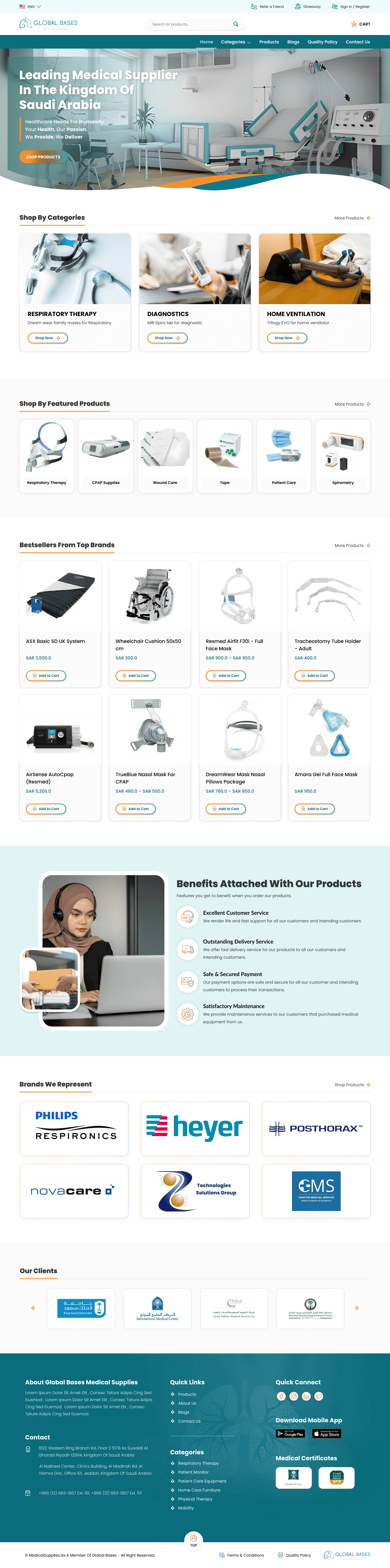
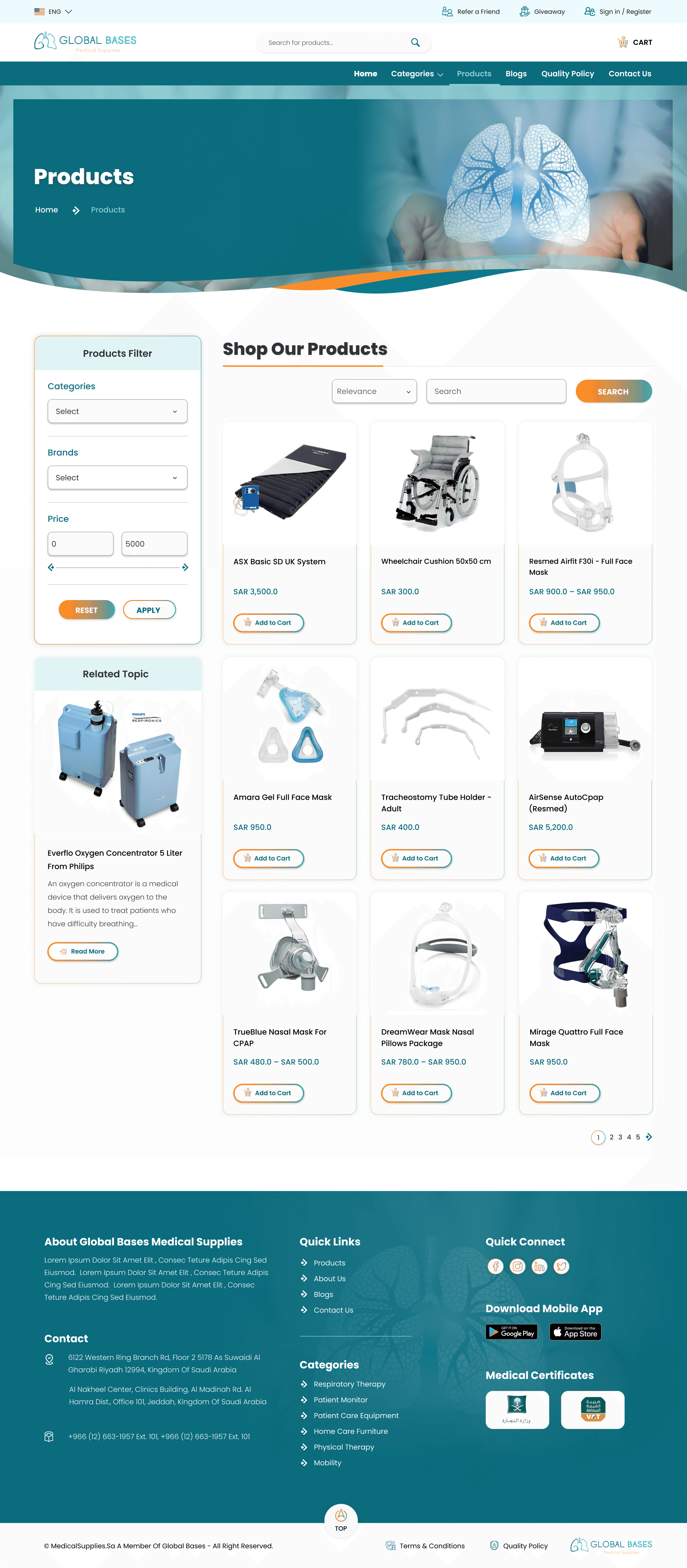
Enhanced Navigation & Search
The website’s navigation needed to be simplified. We proposed a predictive search feature that would allow users to quickly find products by entering a few keywords. Filters based on product categories, pricing, and customer ratings would help narrow down choices.
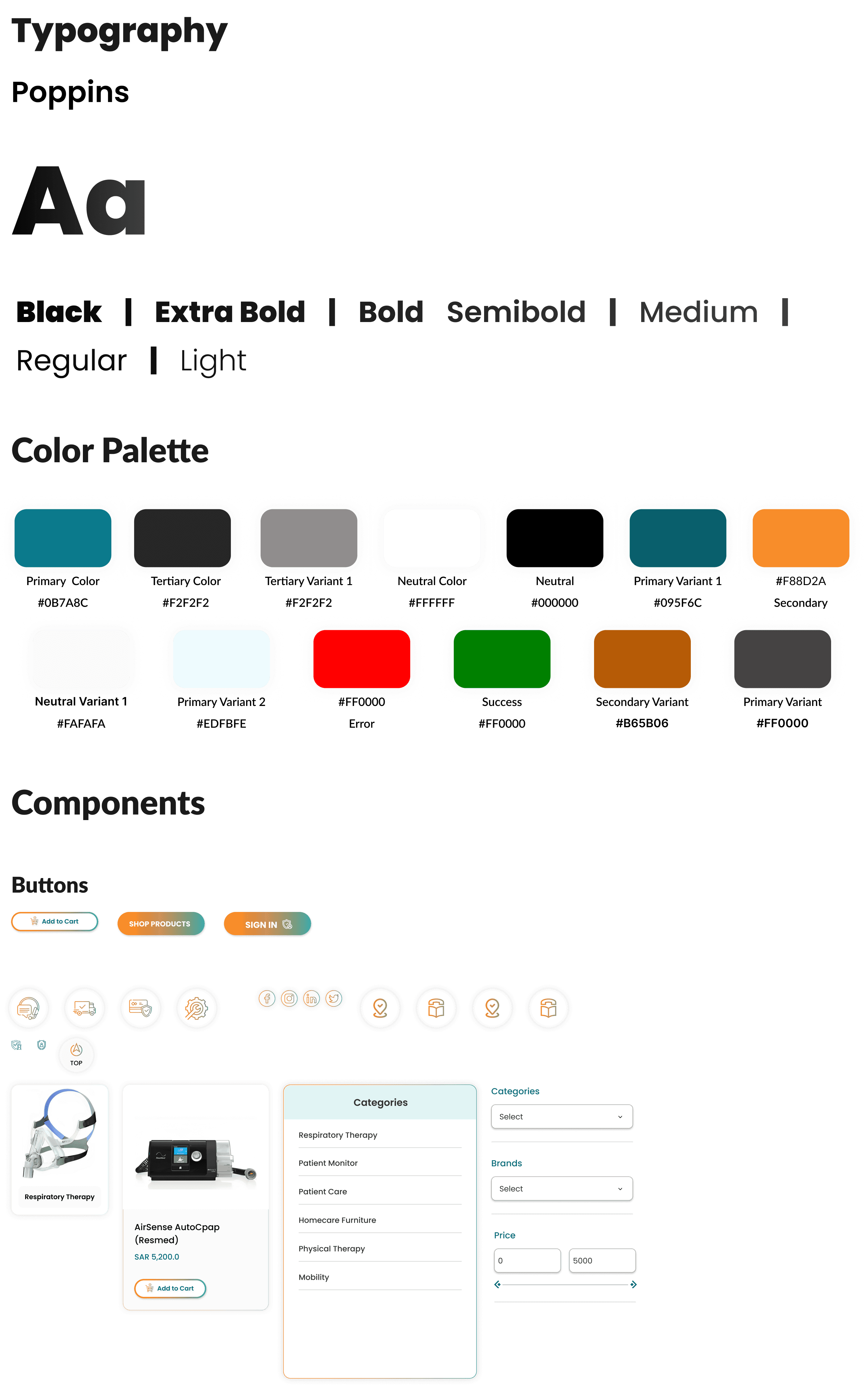
Accessibility Optimization
We proposed redesigning the site to be compliant with WCAG 2.1 guidelines. This included increasing text size, enhancing color contrast, and ensuring the website was fully navigable by keyboard and screen readers.
Improved Product Pages
Each product page would feature more detailed descriptions, high-quality images, customer reviews, and recommended related products. We also suggested a bulk-buy option for healthcare facilities to streamline their purchasing process.
Mobile-Friendly Interface
As a significant portion of users accessed the website on their mobile devices, we proposed a responsive design that would adapt seamlessly across different screen sizes, ensuring a smooth experience.
Clear Call-to-Actions
Design prominent, consistent buttons for key actions like "Add to Cart" and "Checkout," using vibrant, accessible colors.
This solution not only simplified the shopping experience but also aligned with industry best practices, improving overall usability and accessibility.
This proposed information architecture aims to provide a seamless and intuitive user experience for users and the business owners, addressing all their needs.

Here's the task flow for the redesigned medical supplies website:

Here's the task flow for the redesigned medical supplies website:
Success Metrics
After implementing the new designs, I conducted usability tests with the prototypes, which revealed a significant improvement in user interaction. Ran A/B tests to measure user interaction on key pages, such as the homepage, product pages, and checkout process. The results showed promising improvements:
Accessibility Improvement
Challenges
> Initially, I explored a sticky side navigation that followed users as they scrolled. However, user testing showed this was distracting and unnecessary for medical supplies browsing.
> I thought of adding filters directly on the homepage for quicker search, but users found it overwhelming. Instead, I reserved filters for product category pages.
Impact on Users
The redesigned site significantly enhanced user satisfaction, with positive feedback highlighting the ease of navigation, faster checkout process, and accessible features.
Impact on Business
The company saw a promising mark of 18% increase in sales conversions and a 12% improvement in user retention. Additionally, adhering to accessibility standards will expand their customer base by enabling access for new users who previously had difficulty using the site.
Key Takeaways
> Making the site more accessible not only improved user experience for all but also tapped into a new customer base, driving revenue.
> Constant testing and iteration were crucial. Early concepts like the sticky side menu seemed promising but were ultimately not in users' best interests.